

The 8-point grid is a powerful system for creating consistent and visually appealing user interfaces (UIs). This post is about how to establish vertical rhythm and set typography in an 8pt grid system. To get caught up, check out The Intro to 8-Point Grid Systems and get tricky with 8-Point Grid: Borders and Layouts.
What is vertical rhythm and why is it so important?
Rhythm is achieved when the elements of your design are organized into repeatable patterns. This allows your final design to look deliberate, professional, and consistent.
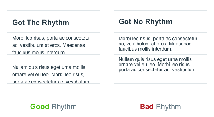
Applying that repetitive spacing to our designs creates a familiar and predictable experience. Zell Liew’s article about why vertical rhythm is so important describes this excellently.
“Repetition breeds familiarity. It has the ability to make things feel as if they belong together. It gives the feeling that someone has thought it all out, like it’s part of the plan.”
— Zell Liew
What is a baseline grid?
You’ll often hear the term baseline grid thrown around in relation to achieving vertical rhythm. A baseline grid allows us to track the vertical distances between type and other objects in a design, and I highly recommend using one to achieve a consistent vertical rhythm. However, remember that native mobile experiences and web browsers measure typography in slightly different ways. This can lead to some confusion for designers and developers depending on the design tools and platform.
How do you measure by baseline?
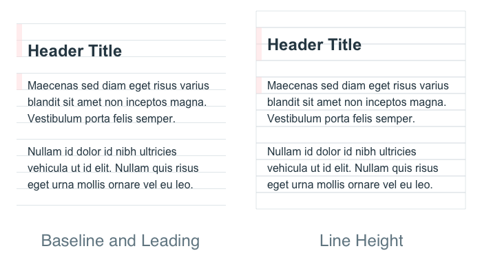
The baseline is where the letters rest. This is a common term in print design and many classic design programs are tailored for it. Native application experiences are generally built off of the baseline.
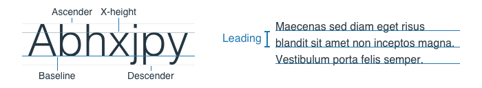
The measurement of space from baseline to baseline in a body of text is called leading. Many design programs will have this as a setting for your typography (Photoshop, Illustrator, InDesign).
How do you measure line-height?
The line height is the bounding box created around your text on the web or in design programs like Sketch or Figma. In CSS the line-height property can be given a pixel size, ratio, or a percentage.
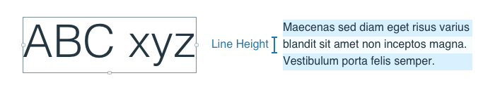
In the example above, the right paragraph has a font-size of 16px and the line-height value could be written as 24px, 1.5, or 150% in CSS.
If typography can be measured two different ways which one do I use?
We’ve established that native and web environments are going to measure typography differently and some folks will have opinions about which way is the right way. Both are valid for their own reasons. There are three approaches from here:
- Measure everything by the baseline.
Your native apps already have this ability. But getting a web browser to measure from the baseline will be tricky. You’ll have to design based on the baseline and then use highly specific spacings to get your content to line up. This will become difficult to maintain and I would not recommend it for large design systems with a lot of surface area. If you want to read more on this approach, Smashing Magazine has a great article about it. - Measure everything by the line height.
This is the web browser’s natural state. Native apps can measure by this method too, although some would argue that it is not as sharp — and the whole point of building native is to offer a higher quality experience. - Allow web and native environments to do their thing.
Be conscientious of the fact that different platforms will want different type of measurements. Roll with it. Shoot for achieving sustainable consistency instead of scrutinizing pixel differences.
Choosing your approach
This is a decision you’ll need to make for your company and/or product based on your constraints and goals. The scale of your web experiences vs. the scale of your native experiences, the number of contributors, and core competencies of the team should be factored into this decision. The larger the team size, the harder it is to pass specific context and follow rules.
How can you reduce the number of decisions your team has to make?
Keep in mind that a consistent system for thinking about typography measurements will always be better than none. You can always iterate on the system but wrangling one-off decisions will be costly.
“Achieving consistent vertical rhythm is the most important part of the design” — Joel Beukelman
Creating Vertical Rhythm
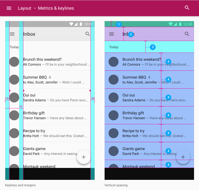
Using the 8pt grid to space the height of your elements into consistent patterns is a great place to start creating vertical rhythm. Anthony Collurafici’s original post about 8-point soft grids does a really good job of explaining a system of laying out blocks of content in Sketch. He also points out the Google Material Metrics & Keylines docs has some great visual examples.
One common question I get relating to 8pt grid is how I setup my grids in Sketch or Illustrator. Truth is, I don’t usually use those features when I’m laying out my UI elements. I’m generally a fan of soft grid layouts and respecting the code as a source of truth. I will use spacing elements in my files to help layout a baseline grid but I generally just measure element to element. I use the 8pt grid as a relative spacial system, not a strict grid.
Additional Reading:
These are some of the articles and resources that helped me answer a few tough questions.
- Zell Liew’s Why is Vertical Rhythm an Important Typography Practice?
- Wilson Miner’s Setting Type on the Web to a Baseline Grid
- Priyanka Godbole’s A framework for creating a predictable & harmonious spacing system for faster design-dev handoff
- Anthony Collurafici’s Sketch Workflow — 8-point Soft Grids
- Google’s Material Design Guidelines about Metrics & Keylines
- Vincent De Oliveira’s Deep dive CSS: font metrics, line-height and vertical-align
- Leigh Taylor — The Grid: Website post has a PSD you can download for examples
Questions or comments?
Thanks for reading, if you have any other links or tips on how you create and maintain a vertical rhythm, share them in a response or hit me up on Twitter.

Change is the only constant, so individuals, institutions, and businesses must be Built to Adapt. At Pivotal, we believe change should be expected, embraced and incorporated continuously through development and innovation, because good software is never finished.

8-Point Grid: Vertical Rhythm was originally published in Built to Adapt on Medium, where people are continuing the conversation by highlighting and responding to this story.


